Project Overview
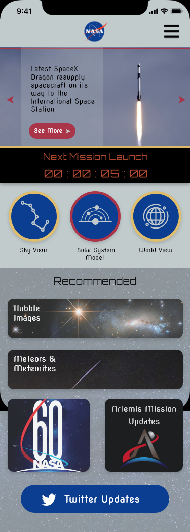
This was a huge redesign on the Nasa app. We noticed there was lot a flaw to it so we decide to reinvent the application.
Our Disciplines
User Experience Design (UI/UX), Information Architecture, Interaction Design, Prototyping, Usability Testing
Our Team
Roberto Izaguirre
Akhil Singh
Shelby LeCamus
My Contributions
End-to-end project delivery, User Research, Information Architecture, Competitive Analysis, Interaction Design, User Testing, Prototyping
The Current Application
NASA initial application was so clunky and hard to find stuff. A lot of the really cool stuff you had to dig for it and go through multiple pages to get to it. Lacking a lot of colors and felt like it was misrepresenting NASA.
Our Methodology
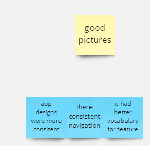
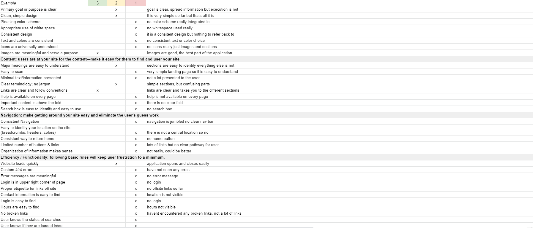
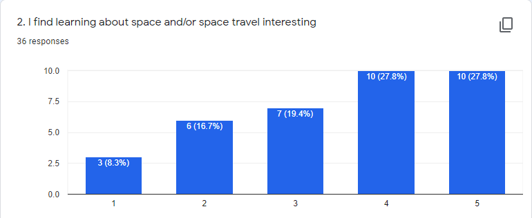
The first step to our process was testing the original application NASA has currently. This was important to see what we can improve on the original application. We started with our UX research we did multiple interviews, a survey , and our user insights.
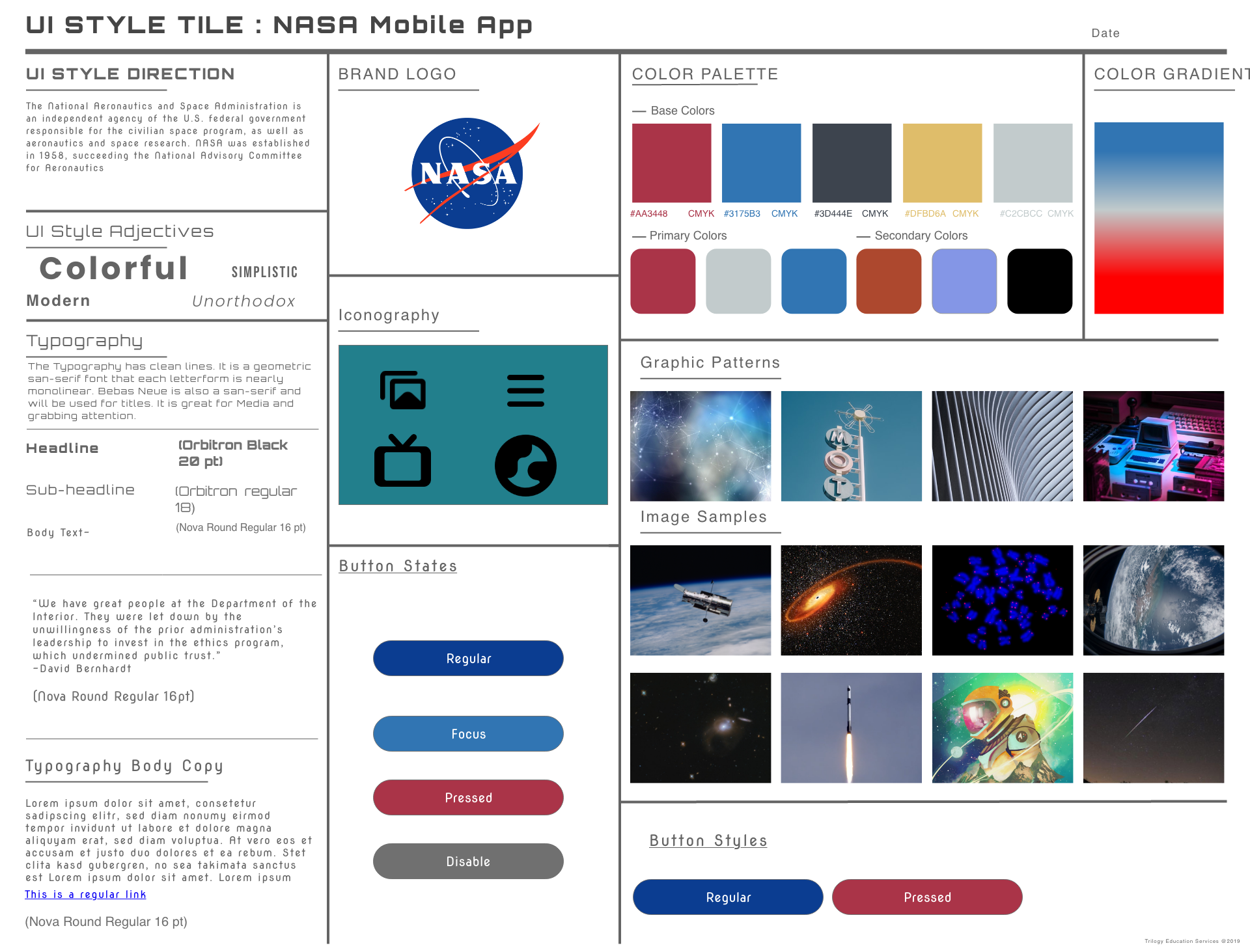
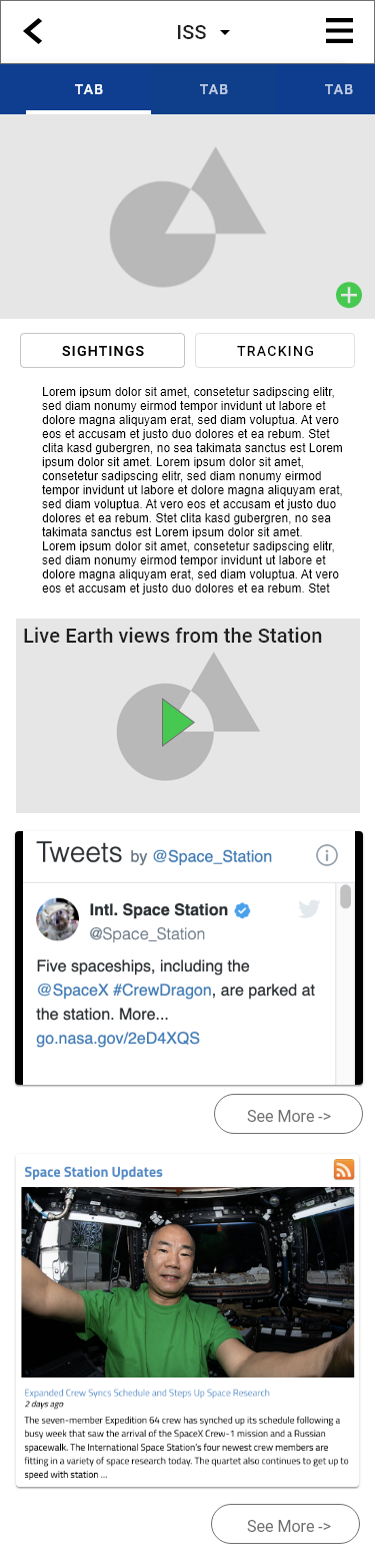
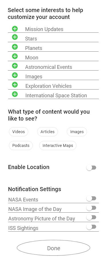
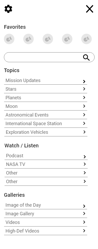
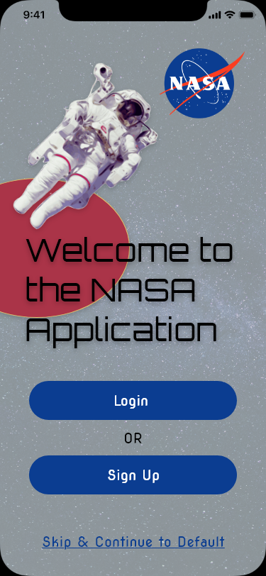
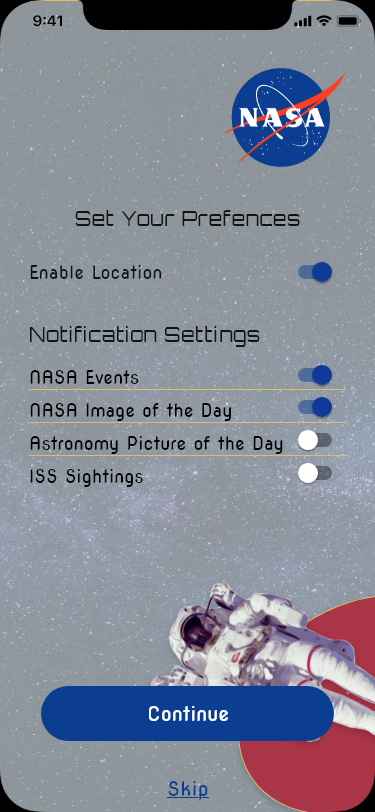
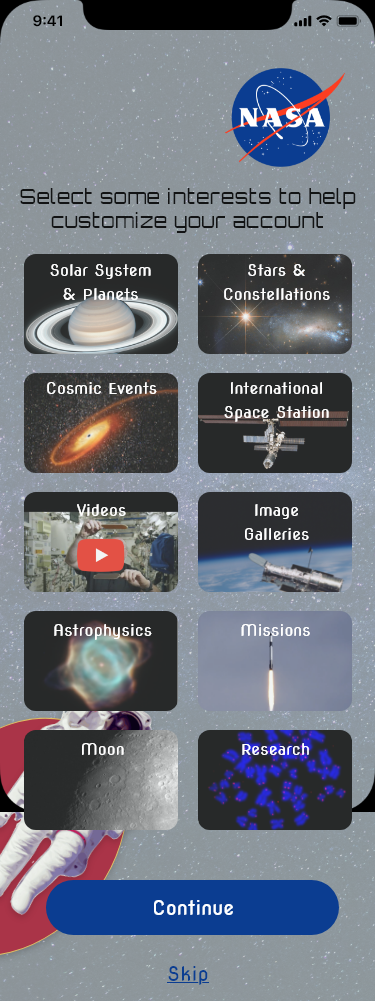
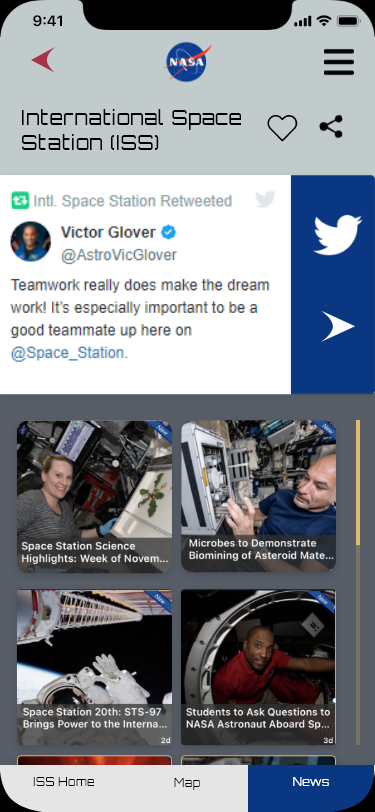
Once we had the initial insights, we began to start conceptualizing the solutions. Mainly focusing on wireframing, user flows, multiple UI testing and other resources.
After we where thought with design the interface. We wrapped up with one final testing to see what we can do in future iterations.
User Research & Findings
The first step we did was User Research. Through this research we made our user persona, hypothesis statement , and problem statement.

5 User Interviews

36 Survey Responses

18 users anonymously responded to a survey we created using google forms. The aim was to look how intrested people are into space and NASA itself.
We conducted 5 interviews to understand user's expectations and pain points of NASA Appplication.
Survey
User Persona
Based on the information we gather from the interviews we formulated a person for the design:
Hypothesis Statement
Our goal is to create a webpage that engages its users by conveying its mission clearly, which will increase the likelihood of user satisfaction and entices users volunteer.
Problem Statement
We believe that a website redesign that emphasizes the mission and community impact of Project Row Houses in narrative form will increase user engagement as well as the likelihood of users volunteering. How might we develop a website that entices our users to volunteer?
Ideation Design
The second part of our methodology . The ideation stage is where we spent the most of our planning and sorting. This helped us understand how our users where navigating the current website and it's issues.
Feature Prioritization
We have constructed our Feature ideas from the previous interviews, survey, and categorized them from the user pain points. These where categories from low impact to high impact and from low priority to high priority. This also referred as the MOSCOW method.
Competitor Analysis
We conducted this analysis to better understand the competitors that direct and indirect competitors. The key issues was that most of the competitors that they are private enterprises, while NASA is government own. The lack of space travel kept coming up with the competitors.
User Flow
Nasa user flow was a bit tricky. In the application, there was so much content it was hard to decipher, which flow would showcase the app in its entirety.
Interaction Design
We looked into more detail on how the user with interact with each iteration we did. We repeated this for all the prototypes to make sure all of the UI elements made sense to the user.
Brainstroming
We first began by Brainstorming ideas with all our past learnings in mind and sketched out several ideas. Then we shortlisted the most interesting and feasible ideas for prototyping.
Heuristics Evaluation
UI Style Tile
User Testing
The final step to our mythology was testing our prototype we created and evaluating the information we received from the those tests.
Lo-Fidelity Prototype
The lo-fi prototypes where simple and bare. When we tested these prototypes it was up scroll that the user liked because it made it easier for them to look at the whole screen compared to the cards we thought of.
Mid-Fidelity Prototype
The mid - fi prototype is where we did the most changes from the testing. The tabs was the most infuriating for the user . The didn't understand if it was a swipe or a click. The home page felt cluttered. The use of iconography didn't really match the layout.
Hi-Fidelity Prototype

After we made the finally ideations we came to the conclusion that user didn't  have trouble navigating through the user flow we had. The last round of testing showed that we need better iconography and better ways to use white space.

Final Thoughts

The Nasa application was super fun to work on and very interesting how one can manage content. The only issues we kept running into was time. I wished we had more time to fully explore the app and break down for future iterations.