Project Overview
Verde was an app design to help vegetarians and vegans to make easier to compare and find places to dine-in that caters to them.
Our Disciplines
User Experience Design (UI/UX), Information Architecture, Interaction Design, Prototyping, Usability Testing
Our Team
Roberto Izaguirre
Gabriella Jackson
My Contributions
End-to-end project delivery, User Research, Information Architecture, Competitive Analysis, Interaction Design, User Testing, Prototyping
Our Methodology
The Methodology was starting with user research. We did multiple interviews and a survey . We gather this information and started are ideation phase which breaks down what the user really wants. Followed by our interaction design and user testing these go hand and hand with each because they determine if the user like the adaption of the app we design.
User Research & Findings
The first step we did was User Research. Through this research we made our user persona, hypothesis statement , and problem statement.

5 User Interviews

4 Survey Responses

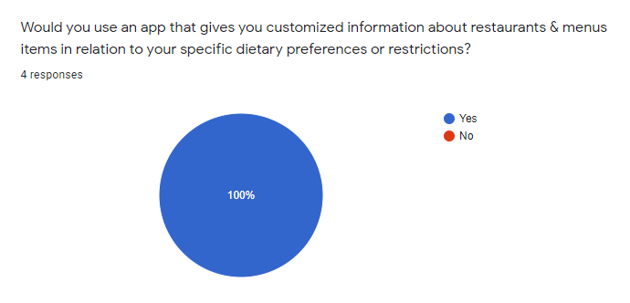
~ 100% of surveyed would use a platform that gives custom & dietary information on a restaurant’s offerings. 
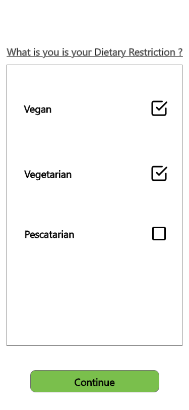
~ 100% surveyed with dietary restriction say they conduct extensive research when given the chance prior to going to an eating establishment.

~ “I hate going to a restaurant and the only food option is a salad.”
- Emily K
~ “The feeling of going to a restaurant and having a full menu of choices is amazing.” - Scott P

Survey
User Persona
Based on the information we gather from the interviews we formulated a person for the design:
Hypothesis Statement
We believe dietary restrictions impact a person's dining experience when eating out and can have negative impacts on ones' experience with a food establishment.
Problem Statement
We have observed that most food apps don't take in consideration the needs of vegetarians and vegans when displaying information which is at he detriment of local businesses and out users' willingness to try new places. How might we develop an app so that our users can easily feel included in their local food scene?
Ideation Design
The second part of our methodology . The ideation stage is where we spent the most of our planning and sorting. This helped us understand how our users where navigating the current website and it's issues.
Feature Prioritization
We have constructed our Feature ideas from the previous interviews, survey, and categorized them from the user pain points. These where categories from low impact to high impact and from low priority to high priority. This also known as the MOSCOW method.
Competitor Analysis
We conducted this analysis to better understand what competitors that are similar to the idea of the app and its function. Verde is very unique in the fact of its objective. This helped understand how to deliver that information in simple and sleek manner.
User Flow
The user flow is simple it helps get to the diner or restaurant like a standard food app. What sets it apart is we wanted to add a compared aspect , so we added to the user flow.
Interaction Design
We looked into more detail on how the user with interact with each iteration we did. We repeated this for all the prototypes to make sure all of the UI elements made sense to the user.
Brainstroming
We first began by Brainstorming ideas with all of our past learnings in mind and sketched out several ideas. Then we shortlisted the most interesting and feasible ideas for prototyping.
UI Style Tile
User Testing
The final step to our mythology was testing our prototype we created and evaluating the information we received from the those tests.
Lo-Fidelity Prototype
The initial prototype was simple , but based upon the idea of looking for a restaurant. The idea of cards and search button was the simplest and easiest to understand.
Mid-Fidelity Prototype
After the first round of testing are findings , we understand that user liked the cards but heavy dislike the idea of a search "button". We adapted it a search bar . Added a map since essential to finding the restaurant location.
Hi-Fidelity Prototype
After we made the finally ideations we came to the conclusion that user didn't  have trouble navigating through the user flow we had .  The user really enjoy the colors and concept of the app. The only real hiccup is the use of white space and taking advantage of the whole screen.

Final Thoughts

For more in depth information:
Full Case Study

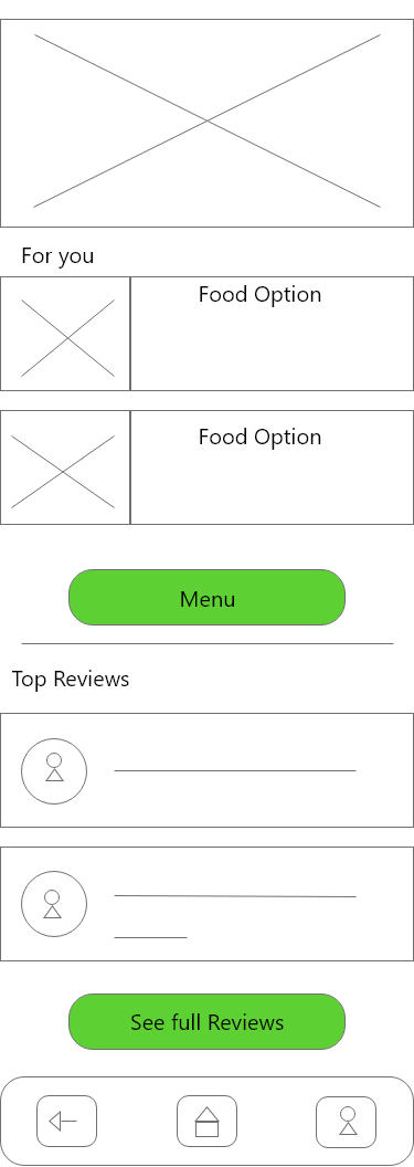
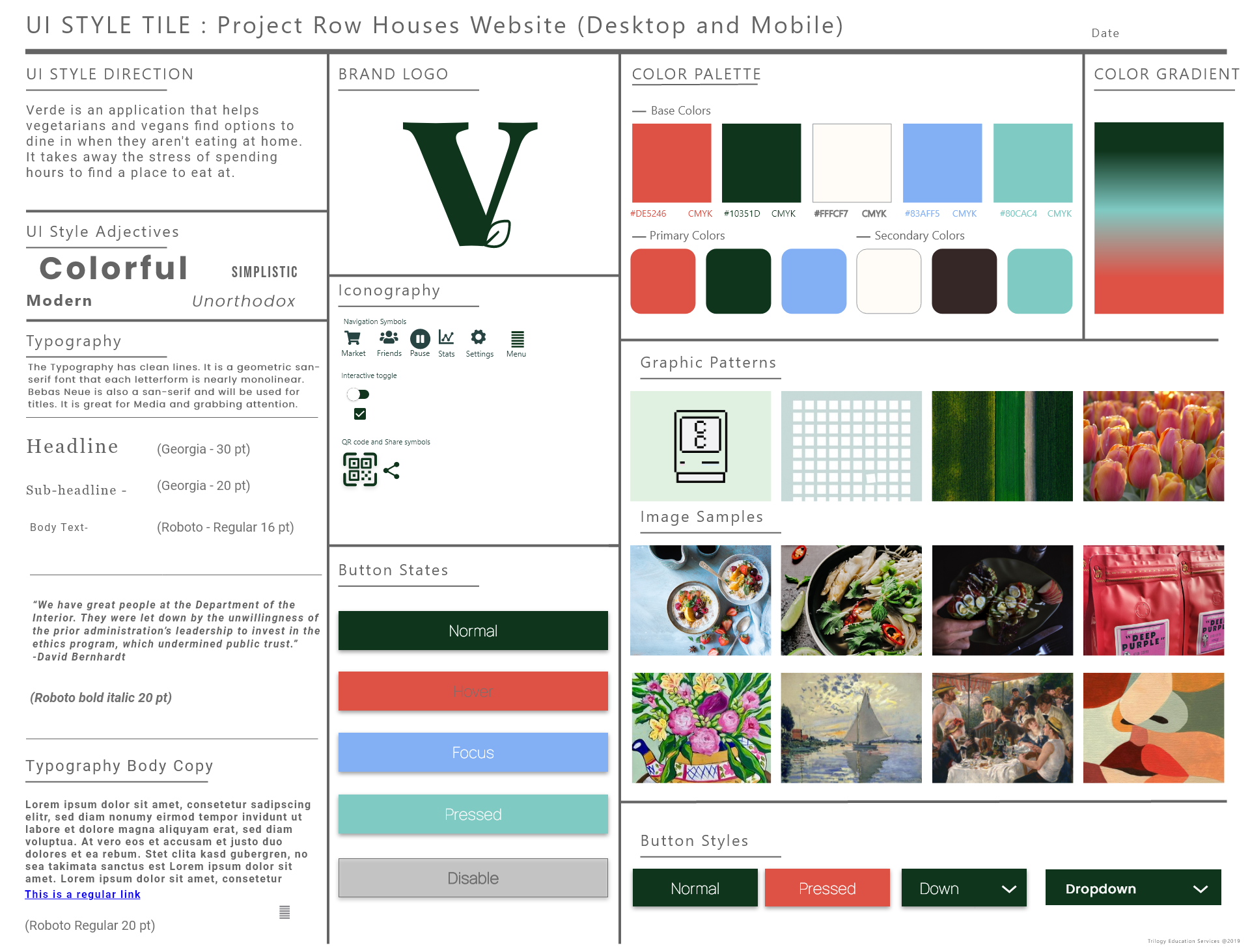
My final thoughts of Verde was that it is an interesting concept. The issue we had was time constraints , it was a week and half project . This rushed a lot of the UI design and I wish we could explore and did more testing. In iteration maybe transfer this idea in a web version to make it even easier to get the information at home.