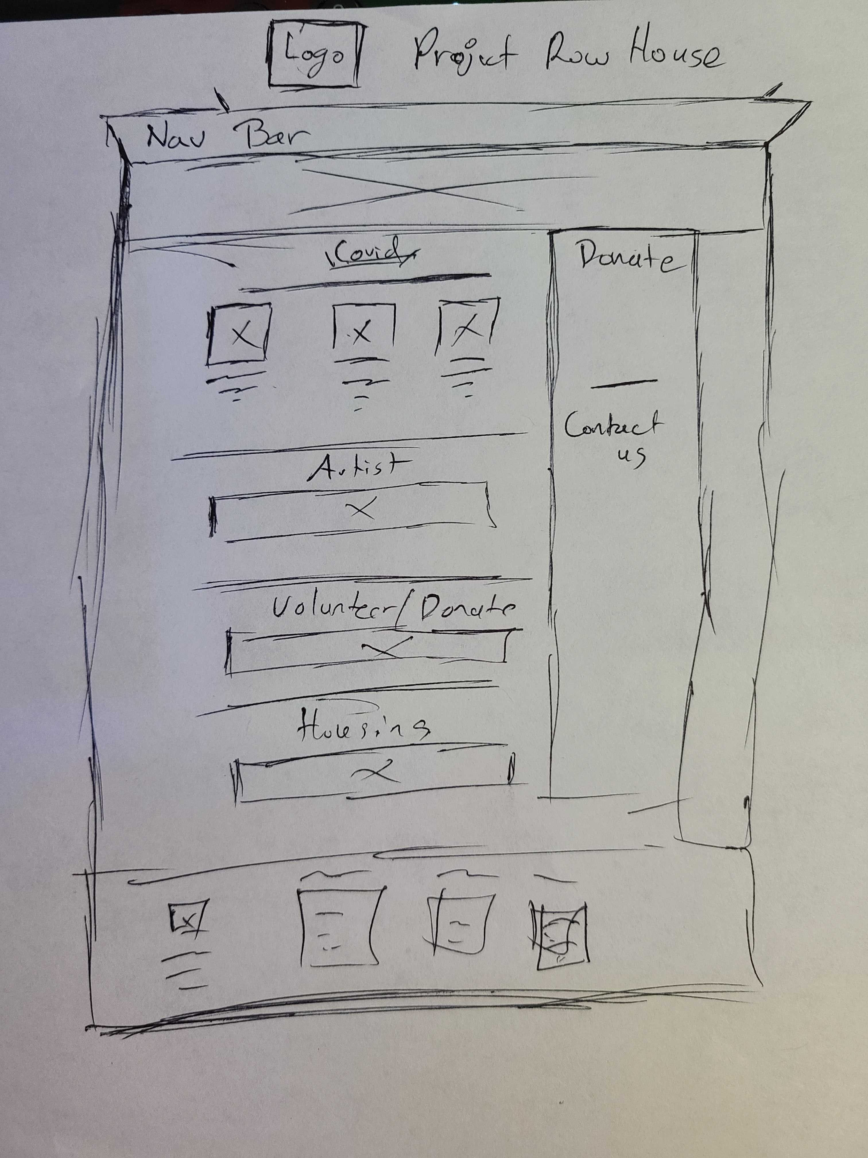
Project Overview
The goal to this project was to bring some life to this non-profit website. At the time , to make it more interactive and easier to find ways to support the cause.
Our Disciplines
User Experience Design (UI/UX), Information Architecture, Interaction Design, Prototyping, Usability Testing
Our Team
Roberto Izaguirre
Nathan Cunningham
Alexis Russell
My Contributions
End-to-end project delivery, User Research, Information Architecture, Competitive Analysis, Interaction Design, User Testing, Prototyping
The Current Website
Project Row House current website has a lot of issues from the rework from the information architecture, along with the improvements in its interaction design. In addition , the website is not mobile-optimized, therefore we need to developed a mobile variant.
Project Row House Current Website
Our Methodology
The first step to our process was testing the original design that Project Row House has currently. This was important to see what we can improve on the original design. We started with our UX research we did multiple interviews, a survey , and our user insights.
Once we had the initial insights, we began to start conceptualizing the solutions. Mainly focusing on wireframing, user flows, multiple UI testing and other resources.
After we where thought with design the interface. We wrapped up with one final testing to see what we can do in future iterations.
User Research & Findings
The first step we did was User Research. Through this research we made our user persona, hypothesis statement , and problem statement.

5 User Interviews

18 Survey Responses

18 users anonymously responded to a survey we created using google forms. The aim was what they look for to support a non-profit.
We conducted 5 interviews to understand user's expectations and pain points of the current project row house website.
Survey
User Persona
Based on the information we gather from the interviews we formulated a person for the design:
Hypothesis Statement
Our goal is to create a webpage that engages its users by conveying its mission clearly, which will increase the likelihood of user satisfaction and entices users volunteer.
Problem Statement
We believe that a website redesign that emphasizes the mission and community impact of Project Row Houses in narrative form will increase user engagement as well as the likelihood of users volunteering. How might we develop a website that entices our users to volunteer?
Ideation Design
The second part of our methodology . The ideation stage is where we spent the most of our planning and sorting. This helped us understand how our users where navigating the current website and it's issues.
Feature Prioritization
We have constructed our Feature ideas from the previous interviews, survey, and categorized them from the user pain points. These where categories from low impact to high impact and from low priority to high priority. This also known as the MOSCOW method.
Competitor Analysis
We conducted this analysis to better understand the competitors around the same area. This gives us a better insight on how we can improve the current website of Project Row House.
User Flow
This flow was to target the Donate and Volunteer routes to the website . These where the most important to us and the user. Through the initial testing it was very difficult to find both of pages.
Interaction Design
We looked into more detail on how the user with interact with each iteration we did. We repeated this for all the prototypes to make sure all of the UI elements made sense to the user.
Brainstroming
We first began by Brainstorming ideas with all our past learnings in mind and sketched out several ideas. Then we shortlisted the most interesting and feasible ideas for prototyping.
Heuristics Evaluation
UI Style Tile
User Testing
The final step to our mythology was testing our prototype we created and evaluating the information we received from the those tests.
Lo-Fidelity Prototype
The initial idea was to make sure the mission statement was loud and clear. The other was to make the navigation easier to navigate. We went with the approach that it should need a button for donate and volunteer.
Mid-Fidelity Prototype
The users generally enjoyed the colorful displays for the website , but the testing revealed a better use of white space . The other thing we took note of was the button got lost in the design we need to add shadows to revealed the buttons more. Finally we limited the use of the buttons to make it more clean.
Hi-Fidelity Prototype
After we made the finally ideations we came to the conclusion that user didn't  have trouble navigating through the user flow we had . The mission statement was clear and concise . The only issue was to fix some of the dead ends and missing links.

Final Thoughts

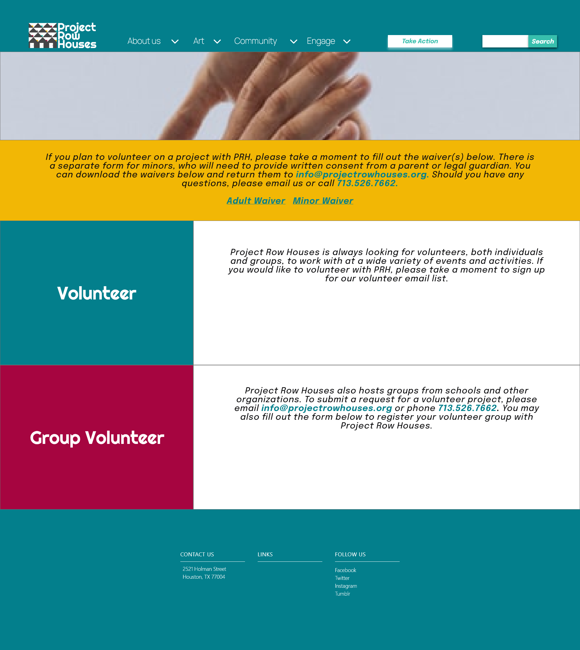
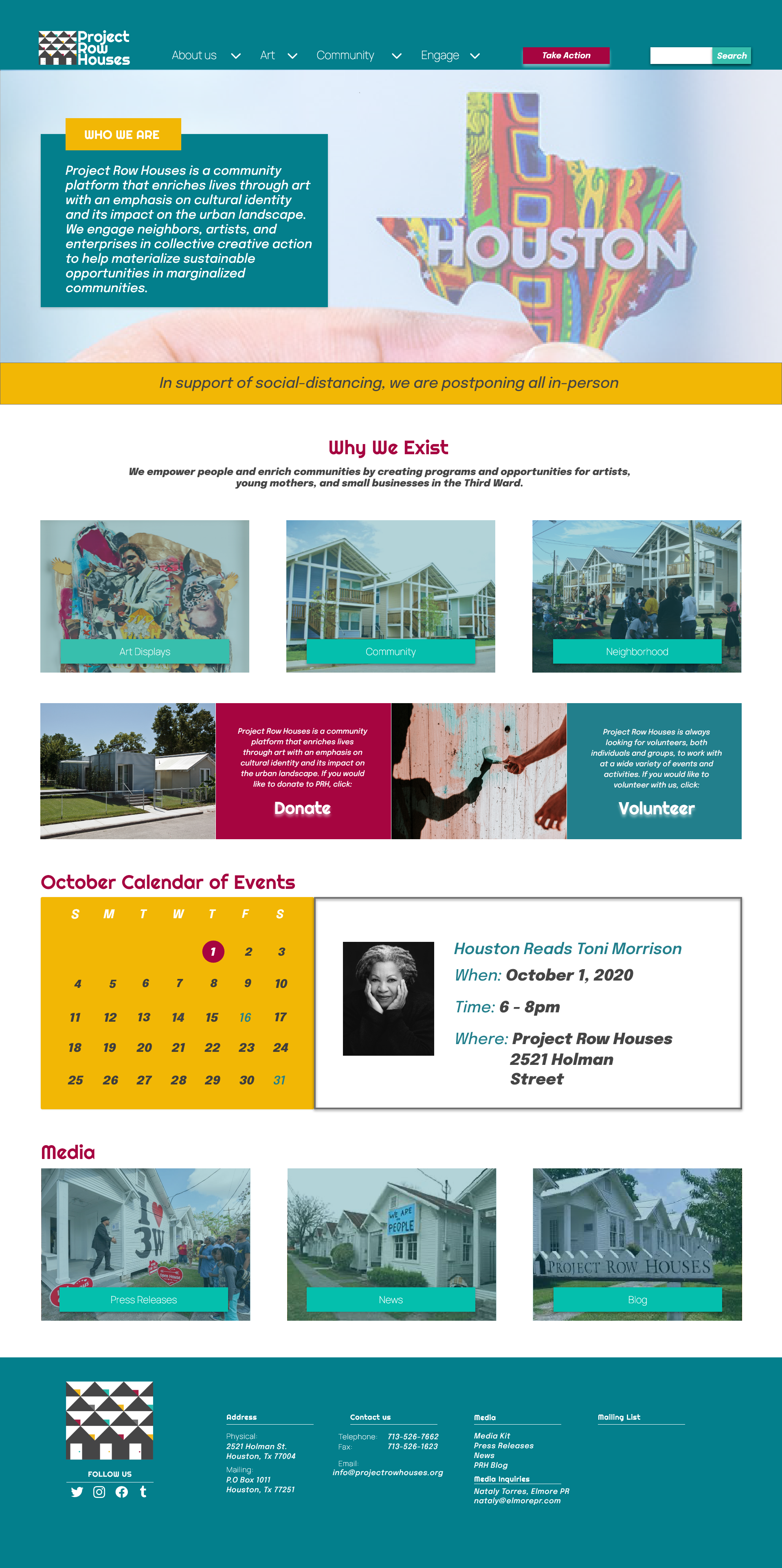
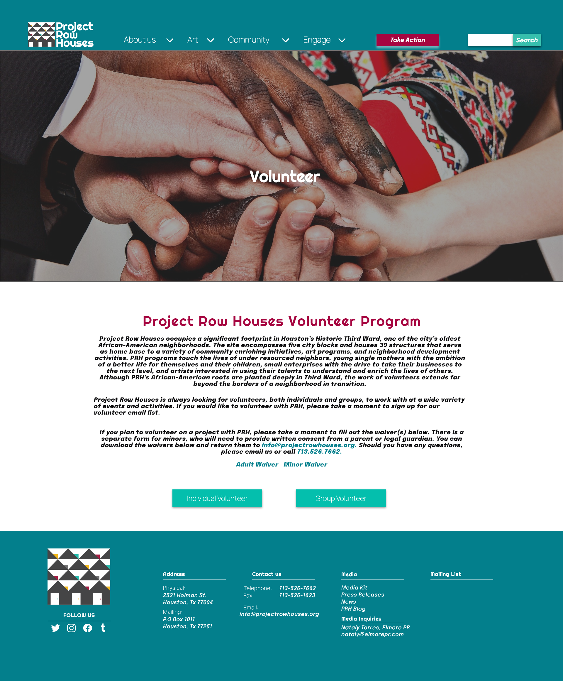
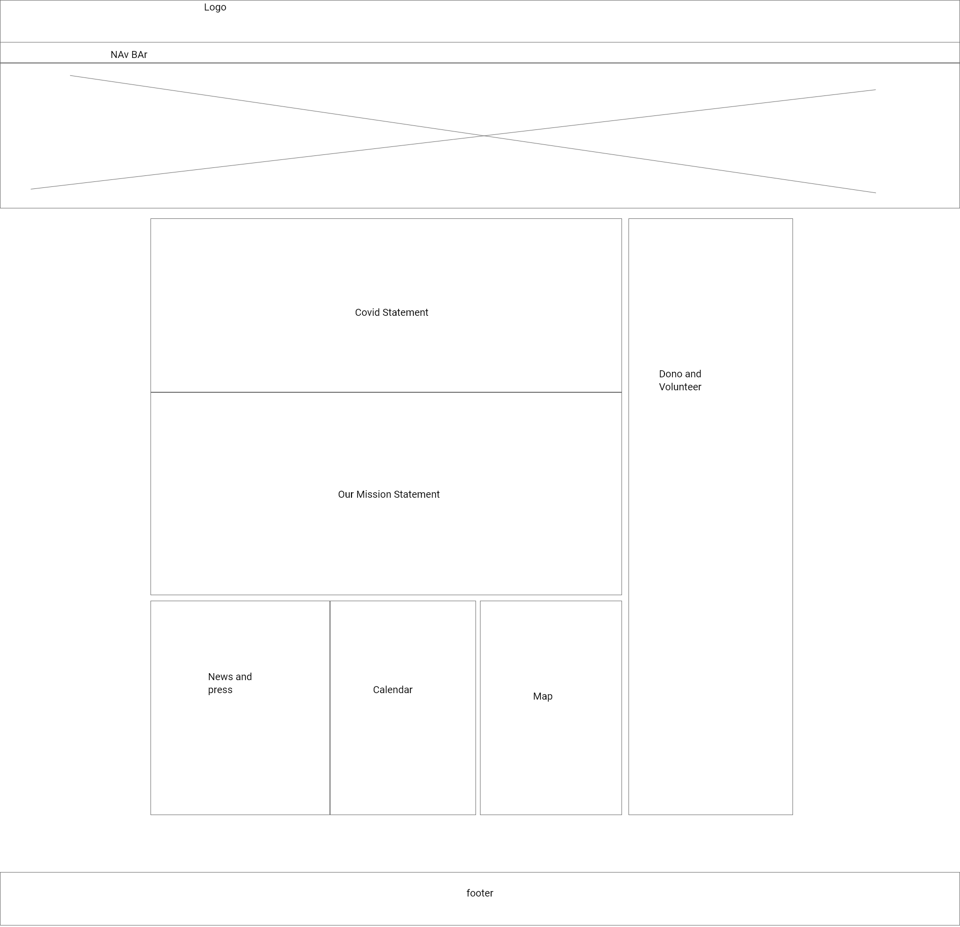
To wrap up , we worked on a mobile device adaptation but it wasn't tested and no where nearly complete. That be are next step of the process. The other issue we had was a time constraint , we worked on most of this with in 2 weeks . I wish we had a little more time to make full product and play with the colors a little more .

For more in depth information:
Full Case Study